This was a confidential internal government system. No screens or proprietory details are available. The below information focuses on the problem, the constraints, and the decisions.
The setup
60+ people divided into different multi-vendor cross-functional teams under the Scaled Agile framework(SAFe).
Core duties:
- •Conception of new features
- •Research via interviews, usability testing, and discovery sessions
- •Wireframes and hi-fidelity UI prototypes. Component library and 2-tier design system in Axure RP (migrated to Figma at a later stage)
- •Advocating for end-users and coordinating between cross-functional teams
- •Ensuring web accessibility
- •Contributing towards writing and managing features and user stories on Jira, and maintaining documentation on Confluence
In a nutshell
Constraints I designed within
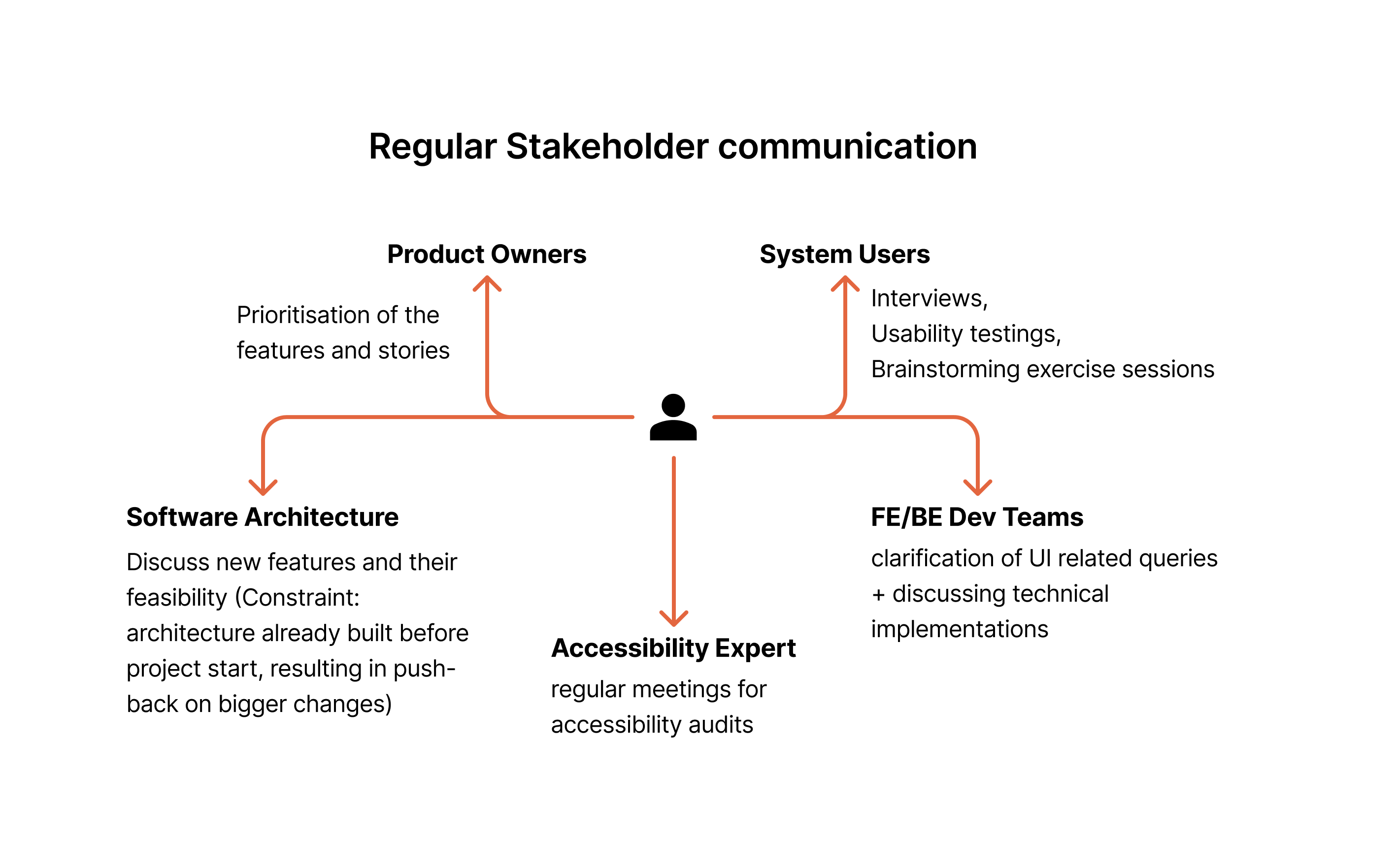
Accessibility was a legal requirement. As a public-sector system, it had to meet WCAG and BITV standards. It was thought of from the very first wireframes and kept throughout the whole process. I extended my own WCAG knowledge, at the same time working with an accessibility specialist on a weekly basis.
I was in regular communication with the software architects. Design decisions had to line up with what was technically possible and what could be delivered in time. As features were conceptualised, my role was to discuss them and work through their feasibility together. The tricky part was that the architecture had been built about six months before the project even started, so the architects were naturally quite invested in it and hesitant about features requiring bigger structural changes. So a lot of my job was navigating that, understanding what could realistically be changed and what couldn't, and advocating for the user need while finding solutions that worked within what they'd already built. Every sprint needed to be balanced between where to push for a better UX and where to simplify things to keep the MVP moving. The hard part was finding that balance without hurting usability or accessibility.
Designing for messy, complex data
The comprehensiveness and complexity of the data was another challenge. Registry records aren't always clean or consistent. We dealt with high amounts of data while addressing the cases where information is conflicting, such as duplicate addresses of the same company. It was important to provide the users a clear way to resolve such queries without losing important information. Principles such as traceability and progressive disclosure were important to address these challenges. The things people needed right away stayed in view, and the rest showed up as it became relevant. Depending on the area, that meant use of tabs, expandable sections, master-detail layouts, or drill-down from tables.
RBAC(Role-based access control) was another important aspect and cases were assigned to individual staff to work on. This meant that absense of case workers needed to be taken into consideration, and a case needed to be able to move from one person to another. Which in turn also requires versioning history, so when a case changed hands, the record of who did what stayed intact.
Every user was able to personalise their interface to suit their "style of working". For example, by saving their preferences of how table should be showed to them, font-sizes, and other visual and layout aspects.